
Fifer’s Web site — on the Web since 1995! |
|||||||
|
|||||||
The Faerie CottageJanis E. Kenderdine © 2005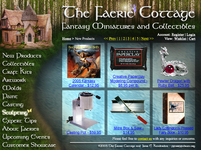
Foreword:This was a project I did for a Photoshop class on screen design. I figured it was a graphics-intensive class anyway, and I’ve done enough “normal” sites, that I could get really funky and creative and say “bah!” to those who would have me make mundane sites for technical content rather than something that looks really cool. ;-) From my accompanying paper:The Faerie Cottage Web site gives the customer a unique Web experience in that it imitates the very art which it sells. Instead of being lost in the many web sites and businesses which cater to the Fantasy art fan or hobbiest, this one is itself a work of fantasy art, attracting the very same creative and art-loving fan and customer base that would buy their products. Instead of another mundane amateur Web site filled with tacky and useless animation, The Faerie Cottage not only gives the user a visually appealing interface, but has a couple of small but interesting elements that intrigue rather than annoy. Instead of the usual hand icon, for example, there is a butterfly with a cross-hair to click on elements of the site. A matching “favicon” would be included in the site design for bookmarks, tabs, address-lines and browsers that support favicon use. Although very visually stunning, the Web-site holds to fairly standard html coding conventions, minimizing cross-platform/cross-browser issues. It does not require plug-ins or extra app downloads to view, and although javascript is needed for the full “light-up” effect of the mouse-over, it will function just as well without javascript turned on. One can have a “see through” effect behind the products that will make the background squares appear transparent on most browsers, as well; however i.e. does not support this css function and may need to use a fixed background. I used a playful “fantasy” motif to go with the theme of the e-store. Although it is a serious business, it caters to artists and craftspeople who may appreciate some eye-candy. It is feasible to create this page for real, however further care would have to go into making a seamless repeatable water texture and grass. It could be somewhat of a challenge to make it multi-sizable, but it is designed in such a way that the pattern could (in theory) be extended to the right and down from the current 640x480 size. I thought the smallest screen-size setting should be the baseline, since it is graphic-intensive, and it would be poor design to make it so that people with a small screen have to scroll around to get the entire effect. The less scrolling and click/drill-down, the better. I tried to make the scene warm and inviting, and used many different gradients to create shadows to make it feel like the user is deep in a forest. I once read a survey that showed that most amateur photographers and the “average person” is attracted to deeply saturated reds and greens, as opposed to the more realistic yellows and browns available in most scenes. So adding to the fantasy feel, I didn’t try to mute it down or make anything specifically warm or cool. I simply tried to have enough contrast between lettering and background to make everything stand out and easily readable. I actually used a variety of fonts, which I don’t normally do. I used Kelt for the graphic text used in the banner, footer information, or roll-over buttons, however this is probably the most you want to do. Regular text is faster to load and faster to change/update. For navigation, contact information and other such things, I (personally) like a serif font (Times New Roman here), as there isn’t too much heavy reading involved, and they follow the format of most storefront web sites, so it’ll only take a glance to understand the navigation, breadcrumbs, shopping cart, etc. However I was told (by my boss) that he’s partial to sans-serif fonts when he has to actually take in information or does heavy reading on a site, so I used Arial for the changing information one would have to pay more attention to such as product info. Although I don’t (normally) like the idea of mixing fonts, I think it works here, and helps subconsciously organize what’s what to the user. Unfortunately, the list of “standard” fonts that everyone (should) have on their computer is somewhat limited to arial, verdana, helvetica, times new roman, courier, etc., which are pretty mundane, overall. But using a less common font may not render correctly on everyone’s machine, and a lot of Web-design is about getting a page to look exactly the same for everyone everywhere, and eliminating the variables. The user can navigate to different sections of the site using the navigation buttons on the left. “Breadcrumbs” above the content pane would additionally prompt the user as to where they are in the site, and allow them to back-track if needed. The cottage graphic would have an image map or href to make it clickable to go back to “home” as well as the banner. Since the site is geared towards the consumer craftsperson or collector, the user can go to a variety of categories of products, as well as read tips from the “expert” artisans, humorous and informative(?) information about faeries, upcoming events/shows/workshops, and finally a customer showcase for photographs of customers’ projects they built using Faerie Cottage purchases. As well as the breadcrumbs, there are navigation hyperlinks to catalog pages (if javascript is enabled, we can see how big the user’s screen is and determine rows/columns of products that way, too), and there are links to your wish-list, shopping cart, login, new account registration, etc. Although I have the know-how to do this web page in vi or some other bare-bones text-editor, I prefer to use Dreamweaver for rapid mock-up and development. Secure shopping cart software and a host would be required, and a registered domain-name would be helpful. Perhaps in future development there can be flash features, but at the moment, I don’t see a reason or a need for it, as it is a virtual store-front, rather than entertainment. I’m not sure if I fulfilled the requirement of an “innovative button” that is appropriate to my theme, as the site doesn’t use the concept of “theme sets.” I think the hover/roll-over effect of the menu items is sufficient. To add beveling to make them “solid” buttons, or to make them fancy in some other way would be overkill, and take away from the overall design, I think. However, I did create a unique butterfly icon though, instead of the standard “hand” or “pointer.” Resources used (extensively reworked): Product graphics: |
|||||||